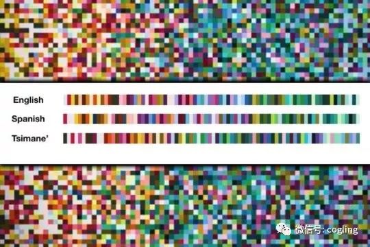
原题:Analyzing the language of color: Cognitive scientists find that people can more easily communicate warmer colors than cool ones
原载:ScienceDaily

In a new study, MIT cognitive scientists have found that languages tend to divide the “warm” part of the color spectrum into more color words, such as orange, yellow, and red, compared to the “cooler” regions, which include blue and green. This pattern, which they found across more than 100 languages, may reflect the fact that most objects that stand out in a scene are warm-colored, while cooler colors such as green and blue tend to be found in backgrounds, the researchers say.
This leads to more consistent labeling of warmer colors by different speakers of the same language, the researchers found.
“When we look at it, it turns out it’s the same across every language that we studied. Every language has this amazing similar ordering of colors, so that reds are more consistently communicated than greens or blues,” says Edward Gibson, an MIT professor of brain and cognitive sciences and the first author of the study, which appears in the Proceedings of the National Academy of Sciences the week of Sept. 18.
The paper’s other senior author is Bevil Conway, an investigator at the National Eye Institute (NEI). Other authors are MIT postdoc Richard Futrell, postdoc Julian Jara-Ettinger, former MIT graduate students Kyle Mahowald and Leon Bergen, NEI postdoc Sivalogeswaran Ratnasingam, MIT research assistant Mitchell Gibson, and University of Rochester Assistant Professor Steven Piantadosi.
Color me surprised
Gibson began this investigation of color after accidentally discovering during another study that there is a great deal of variation in the way colors are described by members of the Tsimane’, a tribe that lives in remote Amazonian regions of Bolivia. He found that most Tsimane’ consistently use words for white, black, and red, but there is less agreement among them when naming colors such as blue, green, and yellow.
Working with Conway, who was then an associate professor studying visual perception at Wellesley College, Gibson decided to delve further into this variability. The researchers asked about 40 Tsimane’ speakers to name 80 color chips, which were evenly distributed across the visible spectrum of color.
Once they had these data, the researchers applied an information theory technique that allowed them to calculate a feature they called “surprisal,” which is a measure of how consistently different people describe, for example, the same color chip with the same color word.
When a particular word (such as “blue” or “green”) is used to describe many color chips, then one of these chips has higher surprisal. Furthermore, chips that people tend to label consistently with just one word have a low surprisal rate, while chips that different people tend to label with different words have a higher surprisal rate. The researchers found that the color chips labeled in Tsimane’, English, and Spanish were all ordered such that cool-colored chips had higher average surprisals than warm-colored chips (reds, yellows, and oranges).
The researchers then compared their results to data from the World Color Survey, which performed essentially the same task for 110 languages around the world, all spoken by nonindustrialized societies. Across all of these languages, the researchers found the same pattern.
This reflects the fact that while the warm colors and cool colors occupy a similar amount of space in a chart of the 80 colors used in the test, most languages divide the warmer regions into more color words than the cooler regions. Therefore, there are many more color chips that most people would call “blue” than there are chips that people would define as “yellow” or “red.”
“What this means is that human languages divide that space in a skewed way,” Gibson says. “In all languages, people preferentially bring color words into the warmer parts of the space and they don’t bring them into the cooler colors.”
Colors in the forefront
To explore possible explanations for this trend, the researchers analyzed a database of 20,000 images collected and labeled by Microsoft, and they found that objects in the foreground of a scene are more likely to be a warm color, while cooler colors are more likely to be found in backgrounds.
“Warm colors are in the foreground, they’re all the stuff that we interact with and want to talk about,” Gibson says. “We need to be able to talk about things which are identical except for their color: objects.”
Gibson now hopes to study languages spoken by societies found in snowy or desert climates, where background colors are different, to see if their color naming system is different from what he found in this study.
————————-
研究论文原文出处:
Journal Reference:
Edward Gibson, Richard Futrell, Julian Jara-Ettinger, Kyle Mahowald, Leon Bergen, Sivalogeswaran Ratnasingam, Mitchell Gibson, Steven T. Piantadosi, Bevil R. Conway. Color naming across languages reflects color use. Proceedings of the National Academy of Sciences, 2017; 201619666 DOI: 10.1073/pnas.1619666114